Relationships Over Time
How did 3000+ romantic relationships fare over time?

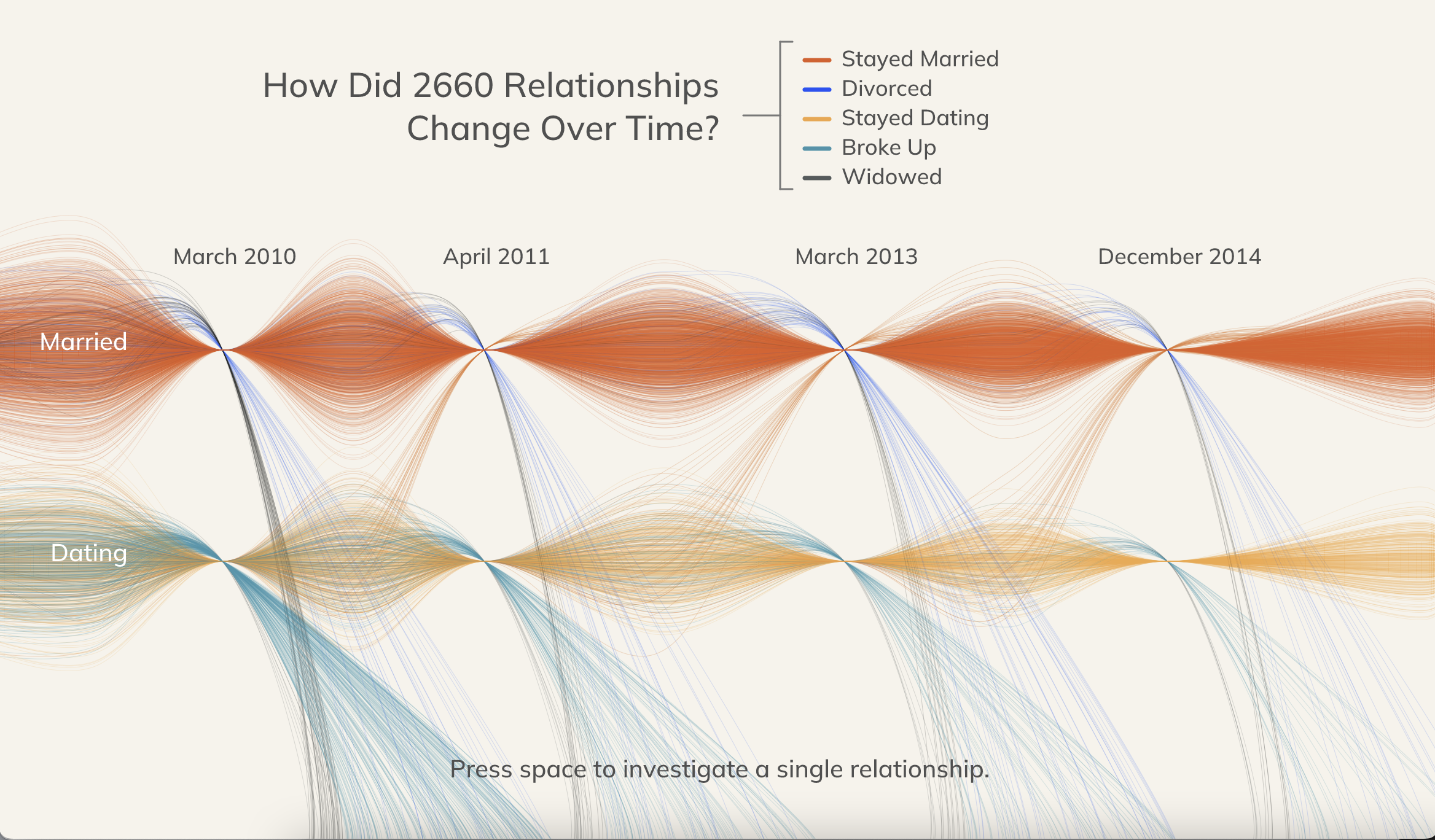
We often hear stories of how romantic relationships progress and fare from an individual standpoint, but rarely consider the behavior of these relationships en masse. In this piece, I sought to depict the constantly changing flow of relationships across thousands of couples.
Using the dataset “How Couples Meet and Stay Together” collected by Stanford University researchers, I created this visualization around three thousand relationships and their progression over the course of three years. Every thin line represents a single relationship, where the color encodes the final state of the relationship (dating, married, divorced, or partner widowed). At each pinch point in the visualization, each representing a different timestamp, some relationships change, and the lines move to locations corresponding to the new state. The result is a river of lines that ebbs and flows over time.