Emissions
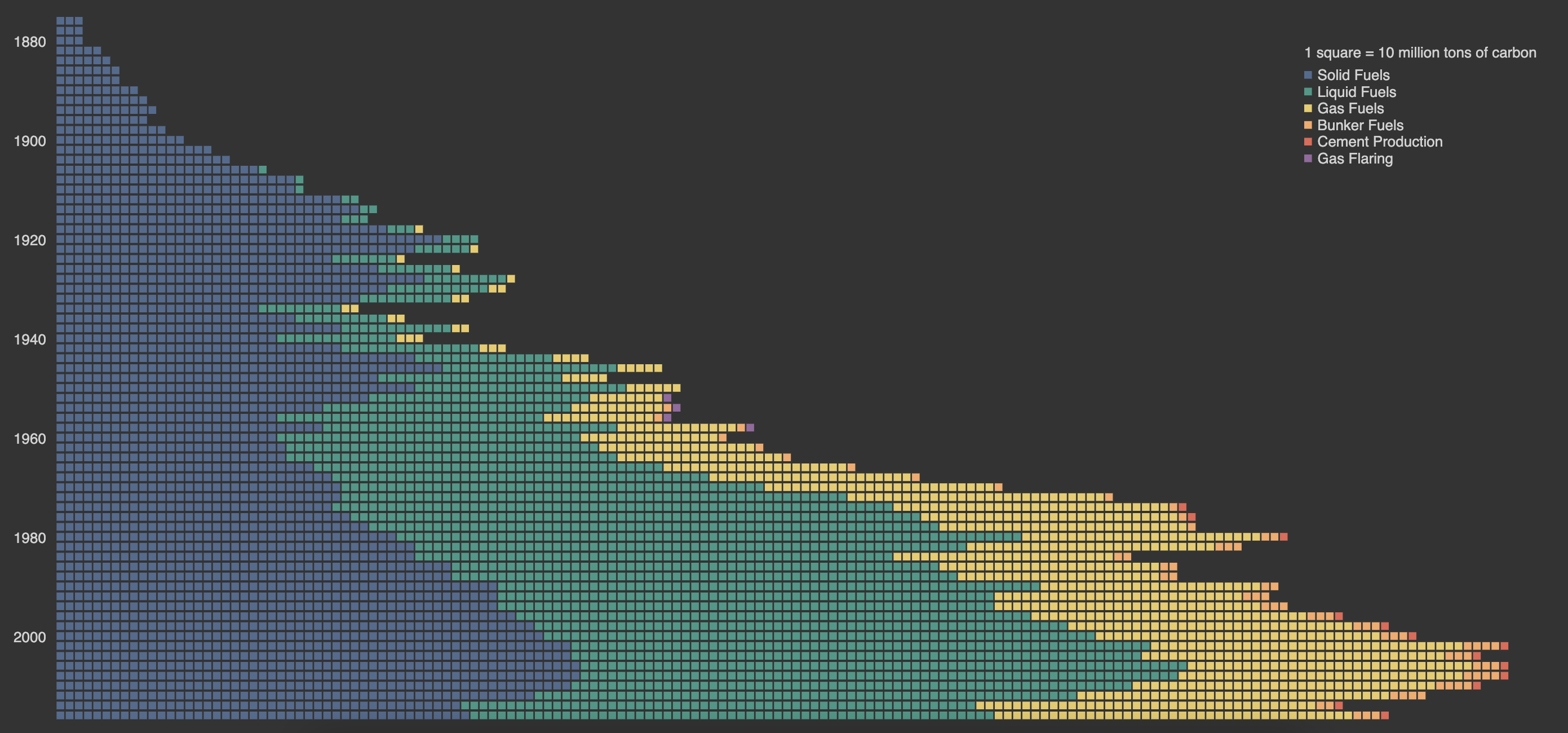
CO2 emissions, broken down.
Data Source: National CO2 Emissions from Fossil-Fuel Burning, Cement Manufacture, and Gas Flaring.
The global climate change crisis is largely a result of the massive amounts of CO2 that are emitted every year. I wanted to visualize how CO2 emissions have changed throughout the decades and also give viewers an understanding of how dire the current situation and provide insight into a breakdown of where these emissions are coming from.
The dataset I found contained data from multiple countries, but I focused on the US data. I cleaned the data using Google Sheets, separating out into multiple columns describing the source of emission. In my visualization, every single square represents 10 million tons of carbon. The color of the square represents the source of the emission, ranging from solid fuels to cement production, which are denoted in the legend.

View this piece on OpenProcessing.