Visualizing Attention
Studying transformer attention via visualizing query and key embeddings.
AttentionViz. The self-attention mechanism in transformer models plays a critical role in helping the model learn a rich set of relationships between input elements. To assist in our understanding of attention, Yeh et al. developed AttentionViz, a tool that enables the visualization of attention patterns at a more global scale. In particular, AttentionViz introduces a technique for jointly visualizing query and key vectors—two of the core components in computing attention—in a shared embedding space. In AttentionViz, every query and key (originally a 64-dimensional vector) is projected to a 2-dimensional embedding space using t-SNE or UMAP. Queries and keys are jointly displayed on the same plot, allowing for the visualization of distinct attention patterns among queries and keys.
Distance as a proxy for attention. A critical idea here is that in the AttentionViz visualizations, we want distance to be an accurate proxy for attention: high-attention query-key pairs should be closer together in the joint embeddings, a relationship depicted in Figure 1b. To optimize for this desired distance-attention relationship, we can take a look at how attention is computed based on the q (query), k (key), and v (value) vectors:
\[\texttt{attention}(q, k, v) = \textrm{softmax}(\frac{qk^T}{\sqrt{d_k}})v\]We see that attention directly corresponds to the dot product between the query and key vector. Therefore, if we are aiming for small distance to be a proxy for high attention, then we want the query-key dot product and distance to have a strong, inverse correlation. Put mathematically, we want the correlation between \(\texttt{dot-product}(q, k)\) and \(\texttt{distance}(q, k)\) to be as close to -1 as possible.
Optimizing correlation. How can we optimize the correlation between the dot product and distance between queries and keys without losing the integrity of the attention computation? Luckily, there are two ``free parameters’’ when computing attention: translation and scaling. The operations of translation (shifting query and key vectors by a constant vector) and scaling in opposite directions (multiplying query vectors by \(c\) and dividing key vectors by \(c\)) can both be performed without changing the resulting attention value. In the following experiments, we largely focus on scaling and identifying the scaling constant \(c\) that provides the best correlation between dot product and distance.
To determine the optimal value of \(c\), we can define a *weighted correlation *metric that places heavier weight on query-key pairs with smaller distances, since we care most about nearby queries and keys in the joint visualization. We first computed a distance threshold \(d\), defined as the 0.5 percentile value of the distance distribution within a specific attention head. For every query-key pair with distance $d_i < d$, we compute the weighted correlation as follows:
\[\texttt{weighted-corr}(x, y, w) = \frac{\textrm{cov}(x, y; w)}{\sqrt{\textrm{cov}(x, x; w) \textrm{cov}(y, y; w)}}\]The weights \(w\) are defined as \((d - d_i)^2\) which assigns more weight to query-key pairs that are closer to one another. We then choose the value of \(c\) that gives a weighted correlation closest to -1.
Building off of the weighted correlation metric, we defined a second optimization metric (weighted correlation, scaled) as follows. Within each scaling factor, we also kept a count of the number of instances of key-query pairs with distance less than the distance threshold. We then enumerated the number of instances across all the attention heads and normalized all weighted correlations within the scaling factor by this count. Again, we choose a value of \(c\) that brings this scaled weighted correlation value closest to -1.
A final metric that we experimented with is the ratio of the median query norm to the median key norm. Differences in norm can cause distance and dot product to diverge from one another; as such, we reasoned that standardizing the query and key norms would bring the correlation closer. Rather than maximizing the correlation here, we simply set \(c\) to be the square root of the ratio itself, as scaling by \(c\) will automatically standardize the query and key norms.
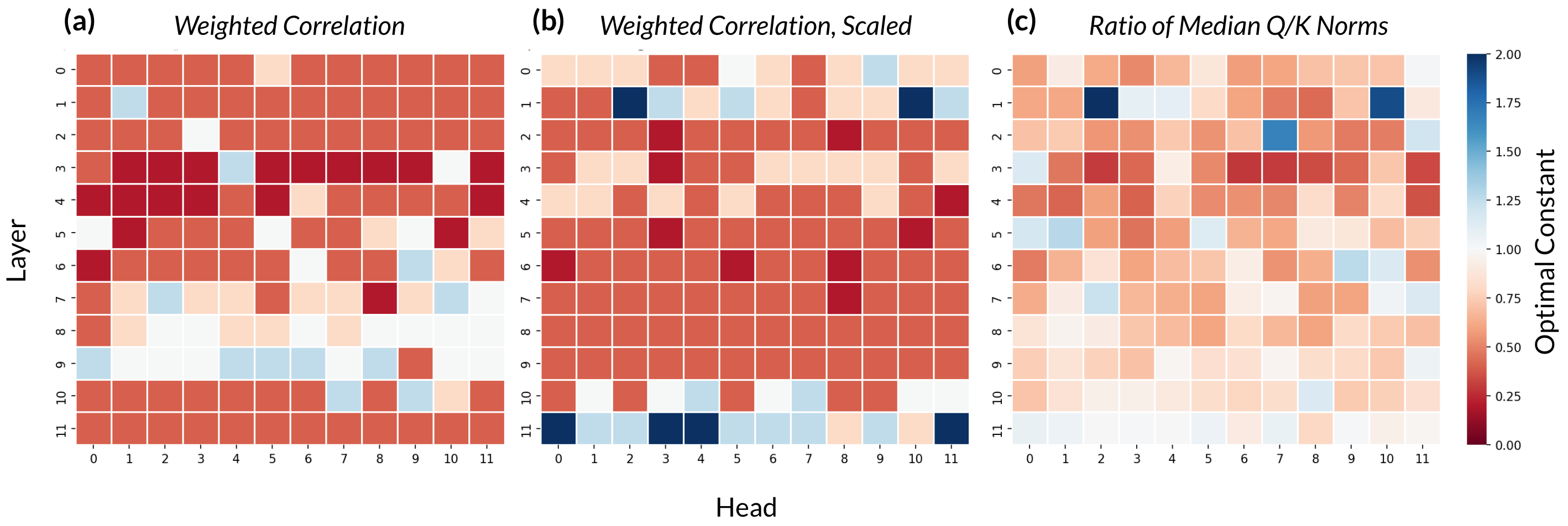
For each attention head, we can thus choose the scale factors \(c\) that optimize the three metrics described above. For each of the metrics, we ran experiments with constants \(c \in [0.2, 0.4, 0.8, 1, 1.25, 2.5, 5]\). Future work could explore the results of a greater range and granularity of constant values. The optimal scaling constants for each metric are displayed in the heatmaps in Figure 1 below.

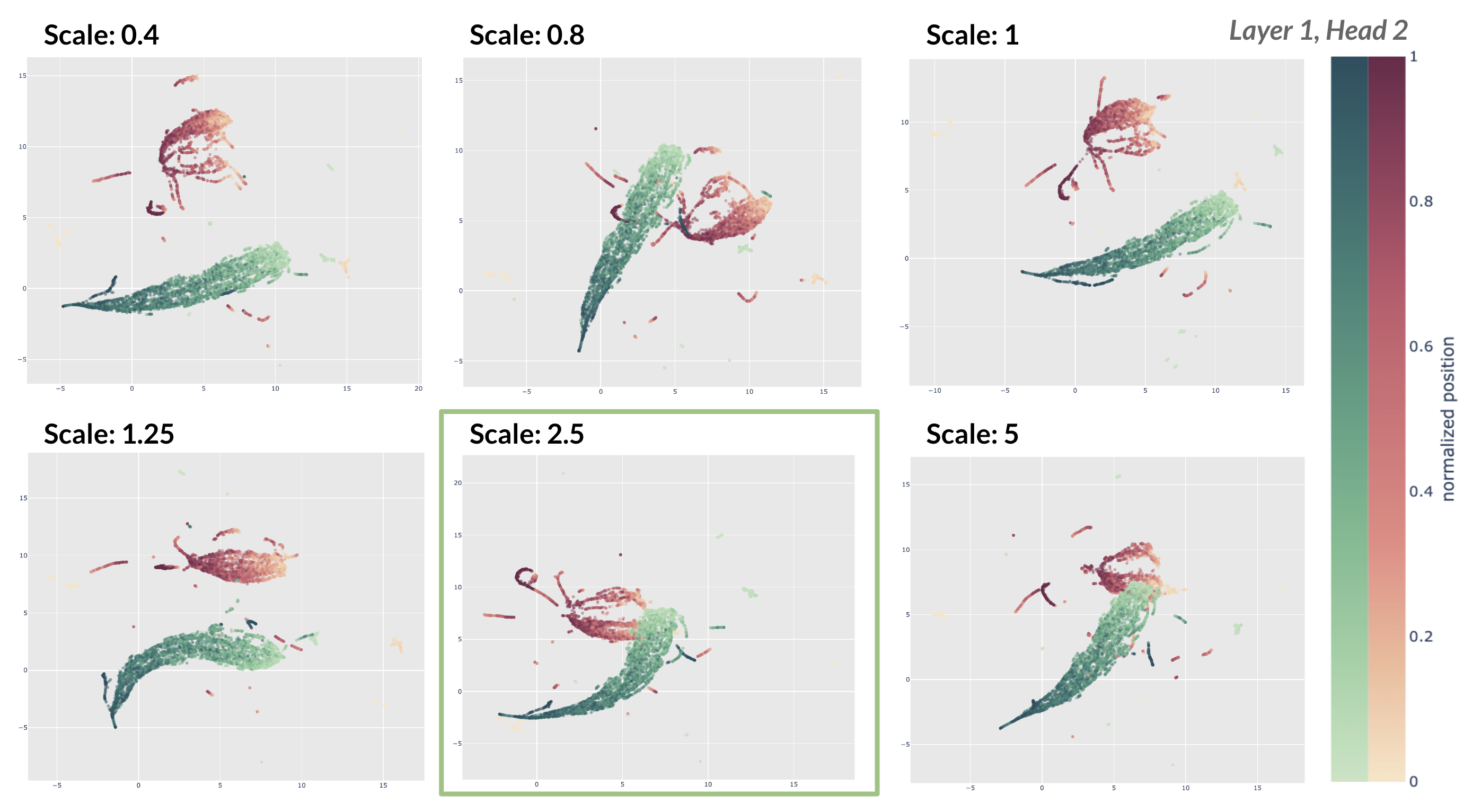
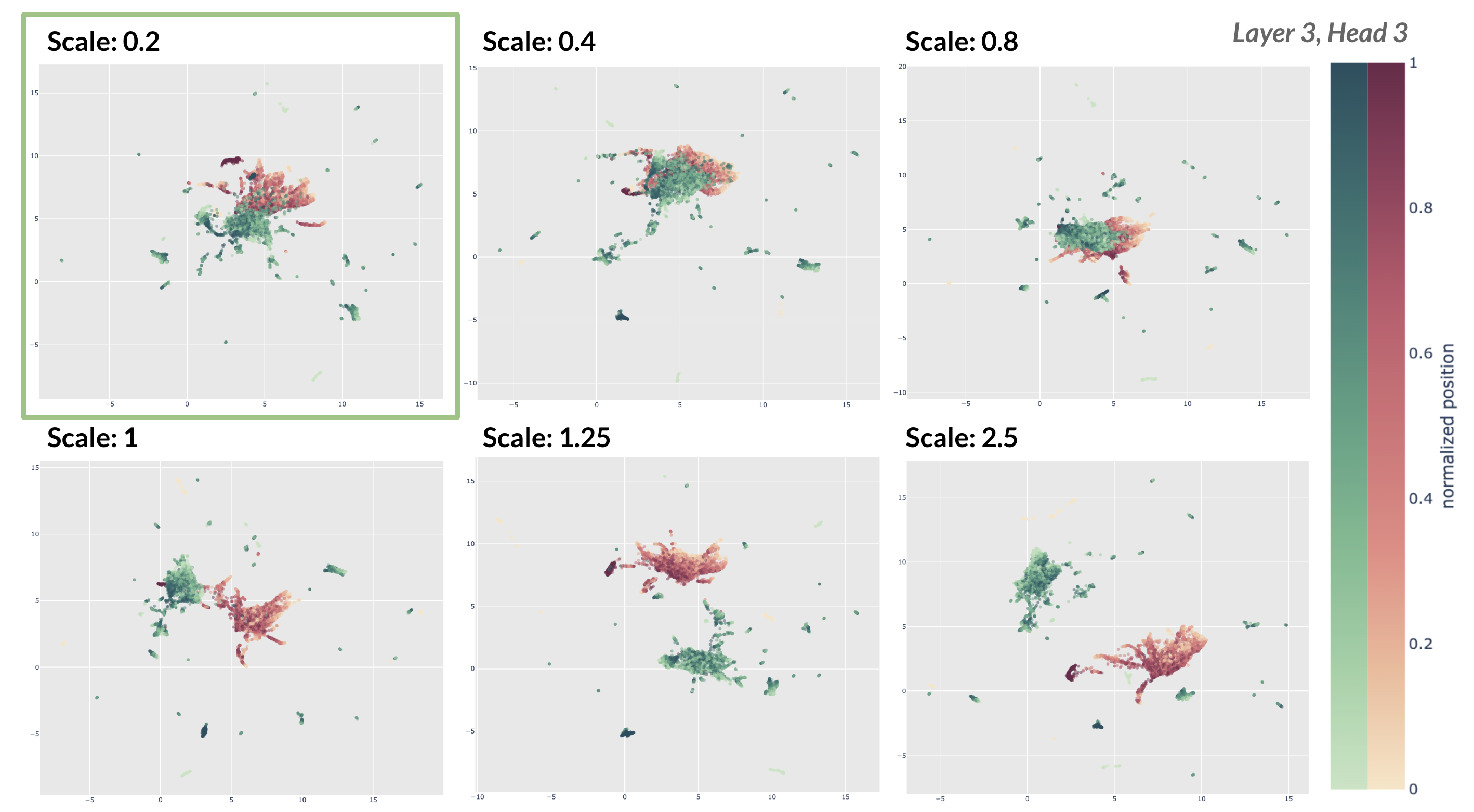
Scaling queries and keys. Here, we show examples of the resulting embedding visualization of keys and queries after they have been scaled. In Figures 2 and 3, we display the joint embeddings for six constants and highlight the visualization with the optimal scaling constant identified by the weighted correlation (scaled) metric as shown in Figure 1b.


For both of the cases displayed, our method chooses a value of \(c\) that yields a strong visualization where the query and key vector clouds are overlapping rather than disjoint. Note that these are visualizations of the query and key embeddings after they have been scaled by the respective constant and then translated so the query and key clouds have the same centroid. Embeddings are generated UMAP using the cosine distance metric.
Future directions. There are several directions in which this work could be continued or extended. First, though we focus on optimizing the correlation between dot product and distance, it remains unclear whether this is the best proxy for attention visualization quality. There may well be several other metrics that could be employed (including the ratio of norms, like we explore in the third metric). Furthermore, the current visualizations only show the query and key embeddings and attention patterns at large and do not depict any particular relationships between individual queries and keys. Future work could look into investigating certain patterns in the visualizations at a more zoomed-in level (e.g: Do noun queries attend to pronoun keys? For a given attention head, how does it match keys and queries?).
This project was conducted at the Insight + Interaction Lab at Harvard University under the mentorship of Catherine Yeh, Professor Martin Wattenberg, and Professor Fernanda Viégas.
Questions or feedback on this project? Email me at cynthiachen@college.harvard.edu.